PDX Spend
A single-issue civic-data instrument. A fund-by-fund ledger of what Portland-area voter money could pay for — and the named rules that hold it still.
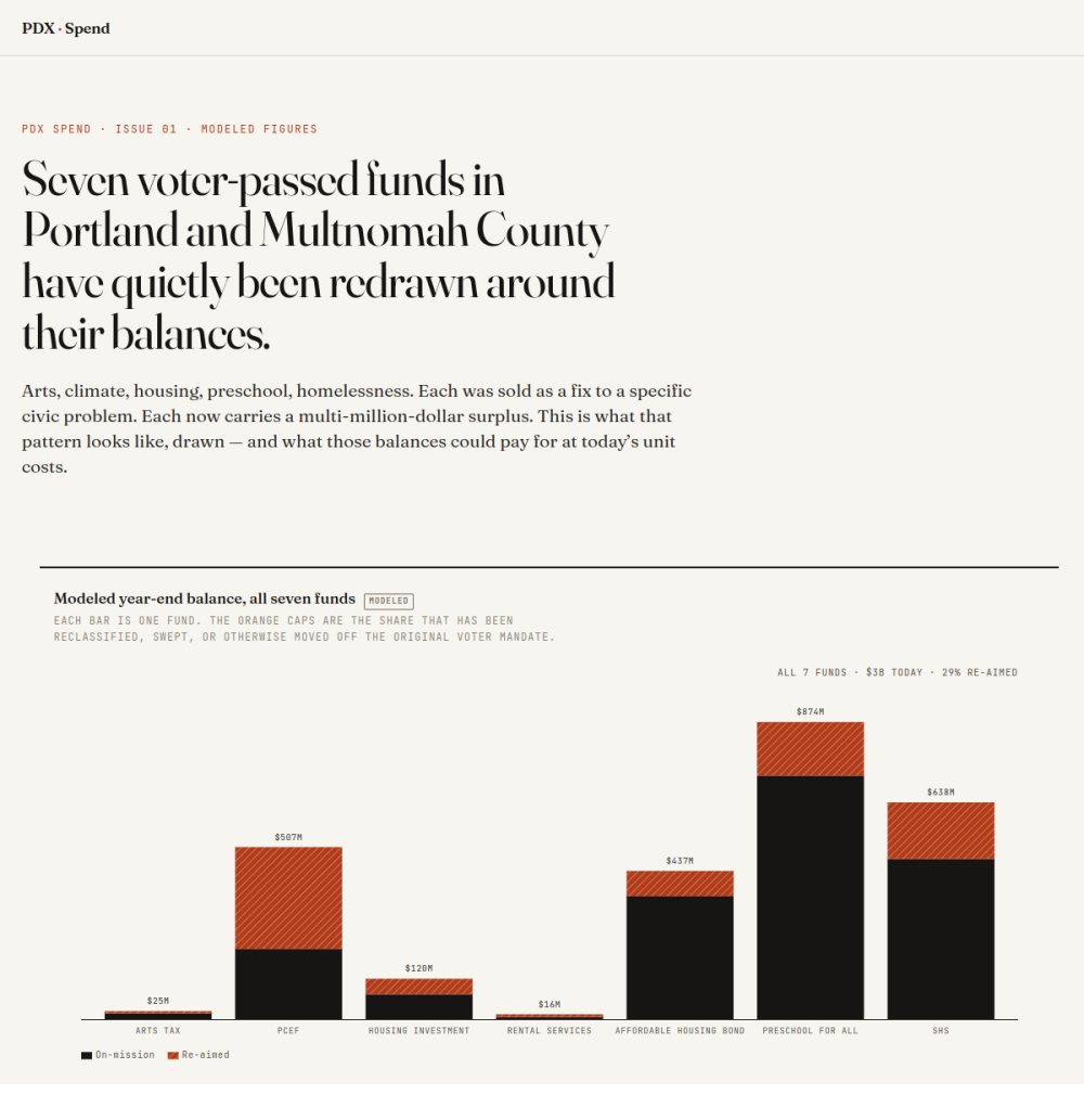
Premise & motivation
Portland-area voters keep approving ballot measures that dedicate public money to specific things — clean energy, parks, housing, preschool. Years later, much of that money is still sitting in the fund, or has been quietly re-aimed at uses outside what voters approved, through ordinary administrative readings of statute. The information needed to contest that exists, buried in audits, ordinances, and budget PDFs that assume a public-finance background.
PDX Spend is a tool for closing that gap. For each of seven funds it answers three questions a resident can act on the same day:
- What could this fund pay for right now, at its current balance?
- What’s the specific rule blocking that?
- Who controls that lever — so you can send them the page?
The editorial stance is deliberately adversarial. When a bureau uses an elastic reading of statute to spend restricted dollars on, say, a private arena’s lighting, the site applies the same elasticity in the other direction — toward what voters actually passed — and names the trade. Every blocker ships with a defense (the line usually offered for it) and a rebuttal (the editorial counter).
Design
Plain-language baseline
Every page follows plainlanguage.gov standards: common words (“money sitting unspent” over “unobligated reserve”), a 25-word sentence cap, active voice, numbers stated before the explanation, headings that assert something usable. Hero copy targets a 6th-grade reading level.
Chart-led longform
Editorial reference points are The Pudding (chart-driven storytelling), the Financial Times visual desk (restraint, chart language), and ProPublica / Reveal (structural framing of public-money stories).
Scrollytelling
Fund pages walk the reader through how a balance got to where it is — the balance line stays pinned while annotated audit and council events step past in the margin, the active step lifting out of a faded stack as it reaches the viewport center.
Honest about uncertainty
Every figure is a modeled reconstruction until audited records replace it. Charts carry a small MODELED badge as the disclosure mechanism. As audited documents arrive, the modeled series swap out and the badge drops.
Editorial palette and type
Fraunces + JetBrains Mono, with a burnt-sienna accent reserved for the “re-aimed” dollars so the eye lands on the contested money.
Technical implementation
- SvelteKit 2 + Svelte 5 runes, fully prerendered via
@sveltejs/adapter-static, deployed as static files to Netlify. - D3 v7 + scrollama for the charts and scrollytelling. Each chart is a hand-built SVG component (balance-over-time, promised-vs-delivered, unspent-reserve stream, drift-from-intent, and a cross-fund stacked view with dollars / share / on-mission modes).
- Accessibility is first-class. Every chart exposes a keyboard-navigable data layer (per-point focus, arrow / Home / End / Escape), an
aria-liveregion announcing the selected point, color-blind-safe pattern fills doubling every color encoding, and a<details>data table mirroring the SVG. - Made to travel. Every chart downloads as PNG and CSV. The dashboard charts are embeddable via an oEmbed endpoint that carries the credit line through wherever they’re embedded — so the argument can be lifted into other reporting.
- Resilient build. The
@workspace/dbimport is dynamic so a static build withDATABASE_URLunset still succeeds (run-history queries return empty). Per-fund memos are authored as markdown and pulled in at build time viaimport.meta.glob.